Methods &
Statistics
General
The Pubmed database was searched for the keywords ‘SARS-CoV-2’, and ‘Covid19’ in combination with ‘biomarker’, ‘D-dimer’, ‘CRP’, ‘IL-6’, ‘troponin’ and ‘urea’. The time period for the first tranche of data collection was set from the beginning of the pandemic to the end of June 2021. All papers reporting mortality data in combination with a biomarker level at presentation were examined further for a Receiver Operating Curve (ROC) analyses and area under curve (AUC). If the AUC was not reported, the authors were contacted to ask if they would be prepared to generate a ROC and corresponding AUC or to share the de-identified data so that this analyses could be done. 1850 articles were examined and 104 papers eventually chosen as the basis for the following analyses. Mortality (30-day mortality and/or in-hospital mortality, dependent on the paper) was used as the end-point.
Receiver Operating Curves
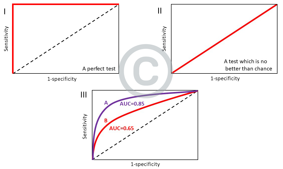
The receiver operating curve is a plot of the true positive rate versus the false positive rate (or sensitivity versus [1- specificity]). It is a simple method which is widely used to show the connection or trade-off between sensitivity and specificity for a test/biomarker or combination of tests/biomarkers.
For a perfect test, the sensitivity is 100% and the [1- specificity] is 0%, resulting in a right-angled ‘curve’, with an area under curve of 1 (see panel I). In a test which is no better than chance, the sensitivity is 50% and the [1- specificity] is also 50%, resulting in a straight line which is known as the ‘line of no discrimination’ (panel II). The corresponding AUC is then 0.5. The better the test/biomarker, the closer the AUC approaches 1. So in panel III, biomarker A is superior to biomarker B as its AUC is 0.85 compared to the AUC of B which is 0.65.

Statistics
To aggregate the data on age and biomarkers from individual studies, the meta library in R was used to report overall mean values and (approximate) 95% confidence intervals (for all studies as well as Asian and N.American/Europeanstudies separately). In addition, the output contains a p-value that captures the statistical significance of the difference between the mean values in Asia and N.America/Europe. This analysis is based on estimates of the standard errors for different studies, which were obtained by assuming that the values for the individual subjects in each study were normally distributed with a study-specific mean. Under this assumption, different measures of spread (IQR, SD and range) were converted into estimates of the within-study standard deviations. Since the estimates of the study-specific means were found to exhibit high levels of heterogeneity within both the Asian andN.American/European categories, a random effects model was fitted as opposed to a fixed effects model in the meta-analysis.
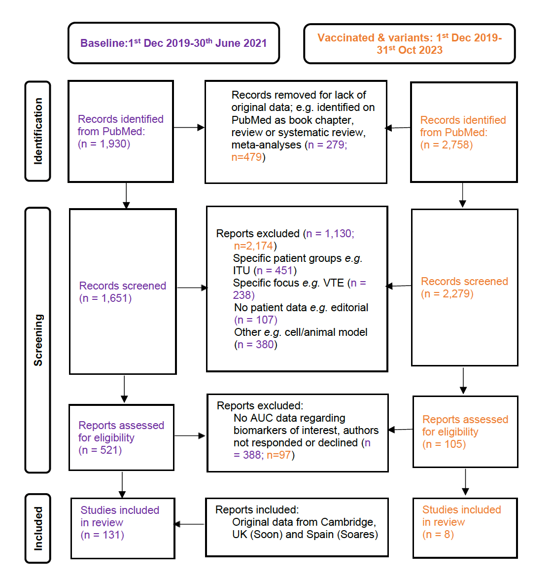
Figure 1
This panel shows a modified PRISMA flow diagram for paper review, selection, and inclusion in these meta-analyses for both the original/wild-type virus (in purple) and for variant and vaccination-related data (in orange).
Forest plots demonstrating all individual studies contributing to the meta-analyses in Asian and European/North American countries for the first tranche of data (from Jan 2020 – June 2021).
Figure 2
Forest plot demonstrating all individual studies contributing to the meta-analyses for CRP in Asian and European/North American countries for the first tranche of data (from Jan 2020 – June 2021).![]() – pooled AUC for European/North American countries
– pooled AUC for European/North American countries![]() – pooled AUC for Asian countries
– pooled AUC for Asian countries
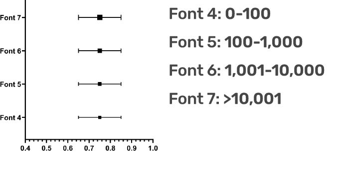
The size of each individual square corresponds with the size of the study population:
Note that:
I) Some studies did not quote 95% confidence intervals and so their symbols lack the corresponding spread. These have been included for completeness although they are not included in the calculation of pooled AUCs.
II) Data from the Cambridge, UK cohort (Soon) and a Spanish cohort (Soares) have not been previously published.
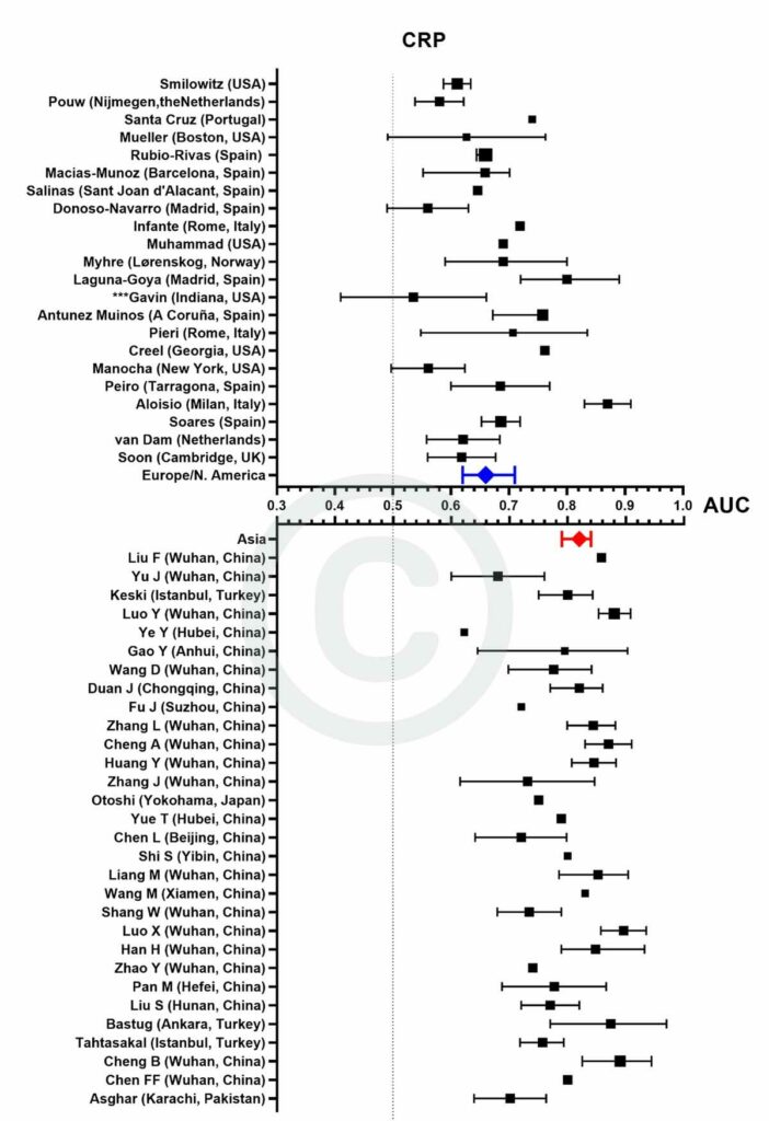
Figure 3
Forest plot demonstrating all individual studies contributing to the meta-analyses for D-dimer in Asian and European/North American countries for the first tranche of data (from Jan 2020 – June 2021).
![]() – pooled AUC for European/North American countries
– pooled AUC for European/North American countries![]() – pooled AUC for Asian countries
– pooled AUC for Asian countries
The size of each individual square corresponds with the size of the study population:

Note that:
I) Some studies did not quote 95% confidence intervals and so their symbols lack the corresponding spread. These have been included for completeness although they are not included in the calculation of pooled AUCs.
II) Data from the Cambridge, UK cohort (Soon) and a Spanish cohort (Soares) have not been previously published.
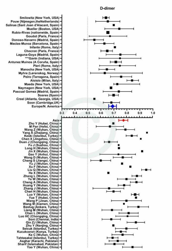
Figure 4
Forest plot demonstrating all individual studies contributing to the meta-analyses for urea in Asian and European/North American countries for the first tranche of data (from Jan 2020 – June 2021).
![]() – pooled AUC for European/North American countries
– pooled AUC for European/North American countries![]() – pooled AUC for Asian countries
– pooled AUC for Asian countries
The size of each individual square corresponds with the size of the study population:

Note that:
I) Some studies did not quote 95% confidence intervals and so their symbols lack the corresponding spread. These have been included for completeness although they are not included in the calculation of pooled AUCs.
II) Data from the Cambridge, UK cohort (Soon) and a Spanish cohort (Soares) have not been previously published.
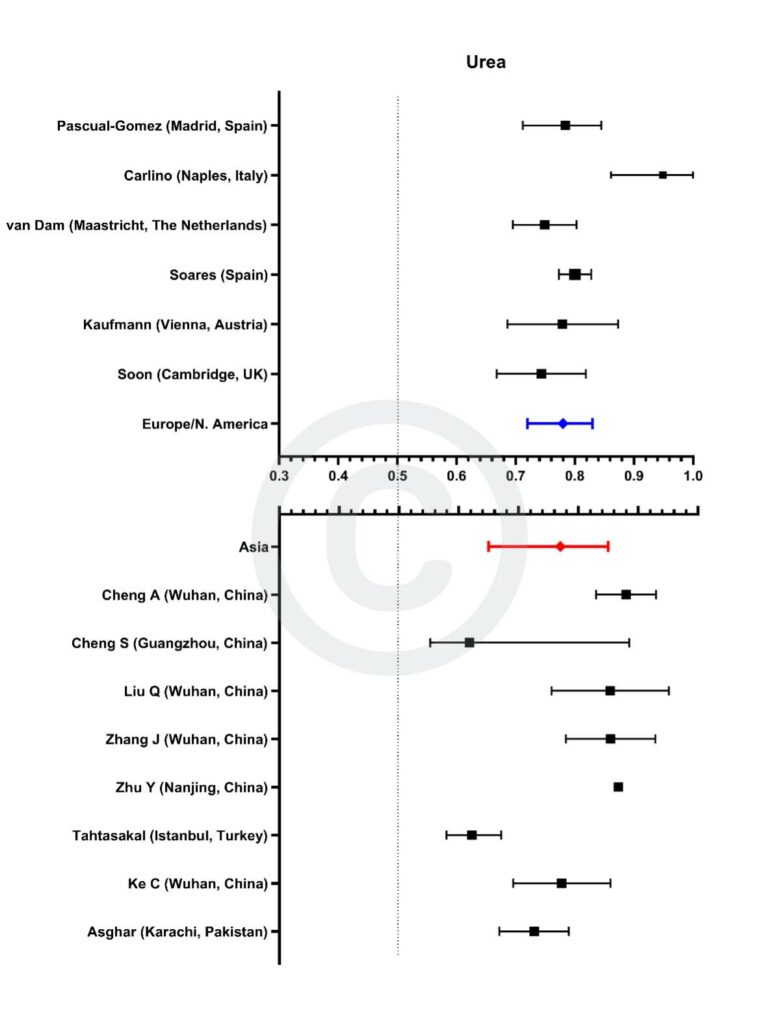
Figure 5
Forest plot demonstrating all individual studies contributing to the meta-analyses for troponin in Asian and European/North American countries for the first tranche of data (from Jan 2020 – June 2021).
![]() – pooled AUC for European/North American countries
– pooled AUC for European/North American countries![]() – pooled AUC for Asian countries
– pooled AUC for Asian countries
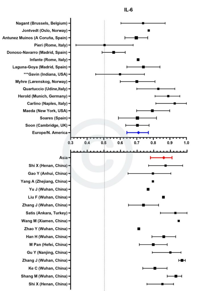
The size of each individual square corresponds with the size of the study population:

Note that:
I) Some studies did not quote 95% confidence intervals and so their symbols lack the corresponding spread. These have been included for completeness although they are not included in the calculation of pooled AUCs.
II) Data from the Cambridge, UK cohort (Soon) and a Spanish cohort (Soares) have not been previously published.
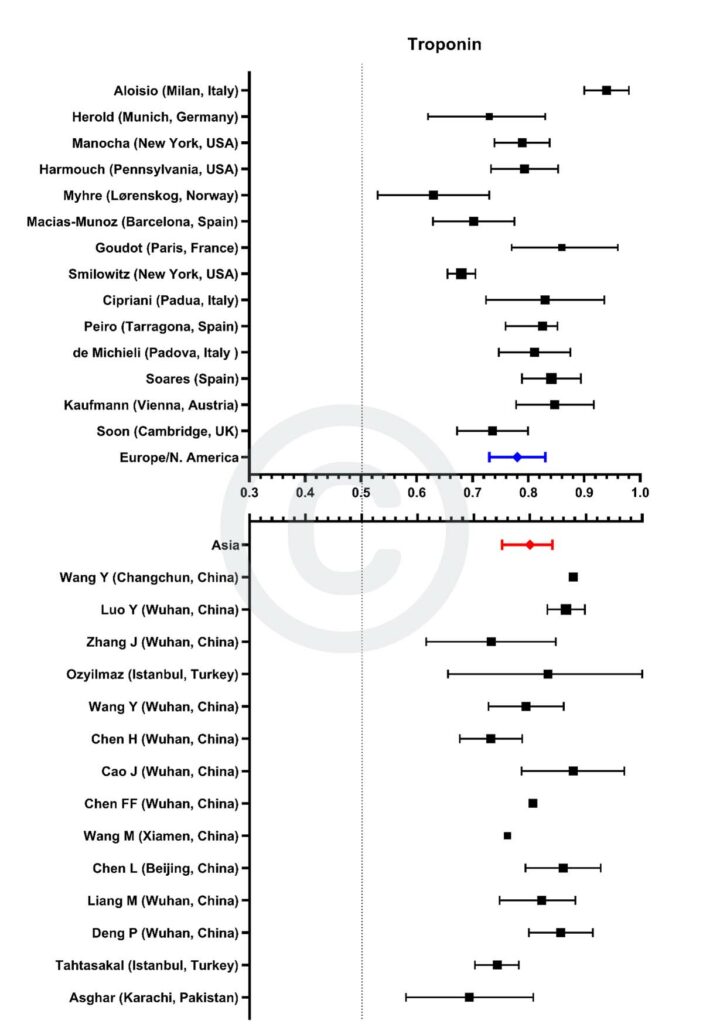
Figure 6
Forest plot demonstrating all individual studies contributing to the meta-analyses for IL-6 in Asian and European/North American countries for the first tranche of data (from Jan 2020 – June 2021).
![]() – pooled AUC for European/North American countries
– pooled AUC for European/North American countries![]() – pooled AUC for Asian countries
– pooled AUC for Asian countries
COVID-19
The Keith Peters Building,
Hills Road, Cambridge, CB2 0XY
Site content © CIMR 2022
